Design Tips & Tricks
Here we share some tips to help you create gorgeous content :)

1. Spacious Design & Aligning items
In this video we’ll give you some tips on how to use white space to give the items on your page more breathing space, and we’ll show you some tricks on how to align items.
After recent updates in Divi, there are some changes:
To reduce the width of an item, when used in full width columns, like in the example at 6:00 minutes in this video or to reduce the width of an image, like in the example at 00:50 minutes, you no longer use ‘max width’ , but now go to Sizing on the design tab of any module, and adjust the Width, for example to 70% to center text and other bigger modules to a more legible width in a full width column, or to any percentage you like, for an image. It’s in most cases also necessary (or more beautiful) to center the module under Module Alignment:
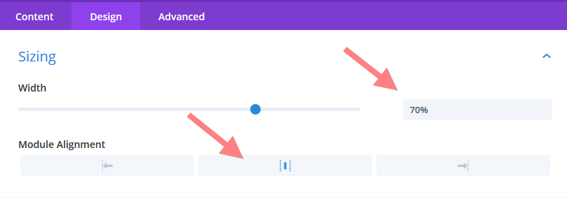
This automatically only adjusts the width for Desktop view, not for tablet or phone. This works well for reducing width of text columns and other bigger items, because usually there are no changes needed for these devices.
For small items like images, you may want to make changes using the responsiveness icon and the tabs as usual as explained in the class Responsiveness.
2. Getting Creative with section Backgrounds & Images
Divi offer some useful new features that allow you to get very creative with your sections and background images. If you don’t see these options for your website, you may have to first update your Divi Theme. Here you can find out how to do that.
In the following series of videos we’ll show you how you can create some beautiful effects using the section background options.
Using photos as backgrounds for sections can be an easy way to give your pages that little extra. Some images are just perfect for it. For example this image below has a large area that is soft and out of focus (often called bokeh) that is just great to place some text on:
Bees and Flowers are the Best!
In this quick video you can see how we created this section:
Not all images are so easy to work with. Many don’t have such a light blurred background to place text on. Luckily there are some great tools for you to play with to allow you to work with almost any image!
For example for the image of the succulents belows, there is a lot happening everywhere on this image, which makes text placed on it less readable and not stand out so well:
Section with image without overlay colour
not very readable :)
But we can still use this image by using overlay colours on top of it:
Section with image and overlay colour :)
In the next video we explain how you can create these overlays:
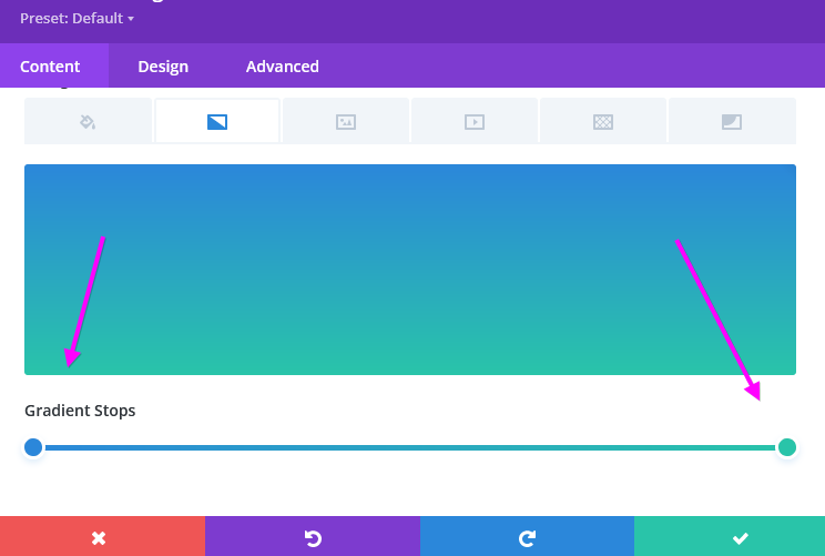
You can also use gradients to create interesting effects, or to only use a slight background colour where you’d like the text to be more readable or better visible. In the next quick video I show you how:
Section with image and
radial gradient overlay colour :)
In the next quick video we show you how:
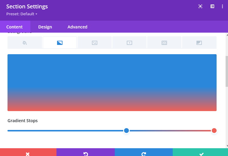
Change to gradients: Gradient stops
The gradients now have new controls, there are two gradient stops:
You can click on each stop to make edits to the colour or transparency as usual.
You can move the stops to vary the amount of each colour in the mix:
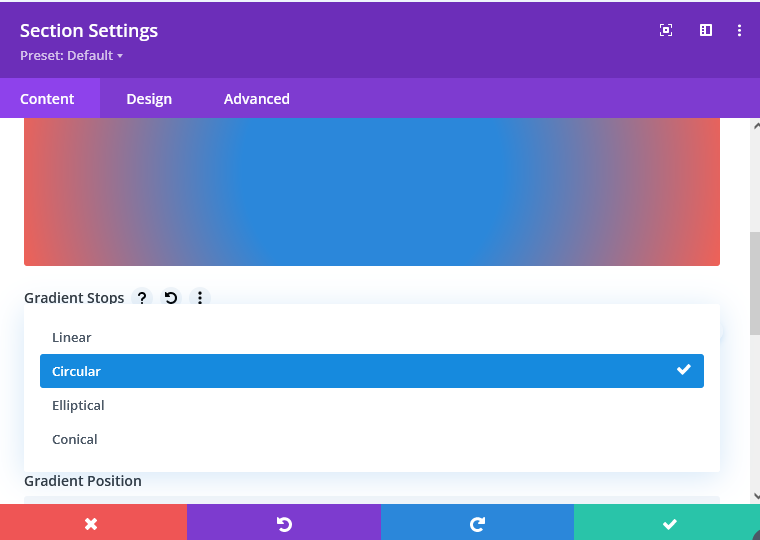
There are also a few new types of gradient you can try:
This section uses the Parallax effect
Do you notice the flower and bees moving when you scroll?
You can switch this effect on on the image tab of the background options:
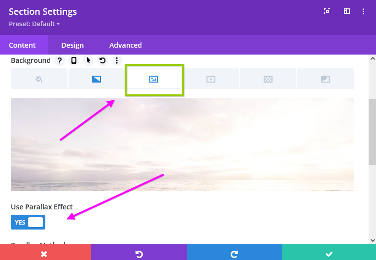
It’s possible to combine this effect on a photo with gradients & overlay colours so you can try different things. It’s good to use a moving effect like this only sparingly across your site so it stays a subtle touch.
By using a background photo on the section in combination with a transparant background colour for rows you can get really creative:
We love Bees
Lorem ipsum dolor sit amet, eum maiorum vulputate at. Possit aliquam scripserit te nec, laudem denique scriptorem eum at. Unum scaevola id duo. Mea ex viris mnesarchum complectitur.
We love Flowers
Lorem ipsum dolor sit amet, eum maiorum vulputate at. Possit aliquam scripserit te nec, laudem denique scriptorem eum at.
Unum scaevola id duo. Mea ex viris mnesarchum complectitur.
If you have columns with different heights of text in them, you can make them show as the same height with a quick setting. For this go into your row and onto the design tab… and there switch on the toggle for equal columns heights. This makes each column as long as the highest one. In the video below you’ll see an example.
We hope you found this class useful – if you have any questions, please let us know!
Happy creating :)