Responsiveness of your website across different devices
Class overview
In this class we’ll show you how you can tweak the look of your website so that it looks good on all devices – from smartphone to desktop.

How to check how your website looks on different devices
Divi’s modules are responsive out of the box, great care has been given to ensure they resize nicely when viewing them on different devices. You can check how your website looks on different devices by using the responsiveness buttons in the Visual Builder.
Go to the page you want to check and tweak the design of and click on “enable Visual Builder” if the Visual Builder isn’t active yet. Click on the purple circle to expand the visual builder menu. In the bottom left corner there are 4 icons, the desktop view icon is highlighted in green:
When you click on one of the other devices, you can see how your website resizes when viewed on Tablet or Smartphone, here we show Tablet view:

You can scroll through the page, and if there is something you don’t like the look of you can go into the settings of that particular module on the page, and adjust the settings for that device.
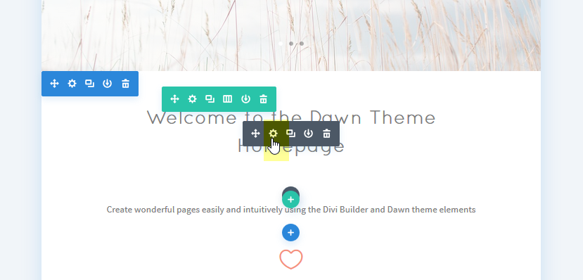
Let’s say I’m not happy with how large the title “Welcome to the Dawn Theme Homepage” is on Tablet view and want it to be displayed smaller on tablets.
Go into the module text module to edit its settings by clicking on the module settings icon:
Go to the design tab of the module. You’ll notice that next to several settings there are smartphone icons. The Settings that have icons can be adjusted for different devices:
To adjust the size of my header, I will need to adjust the setting “Header Font Size” . When you click on the smartphone icon next to it, tabs with options appear:

I can now adjust my Header font size when viewed on Tablet by using the slider while viewing the result on the left, see image below. By clicking on the smartphone tab you can also make adjustments for smartphone viewing.

Remember to save your settings.
By using these tools you can check all the pages of your website on different devices, and make tweaks where necessary :)